What Is Web Accessibility (a11y)? A Practical Guide
Web accessibility (a11y) means building sites usable by people with disabilities. The core principles, semantic HTML, ARIA, and common patterns.
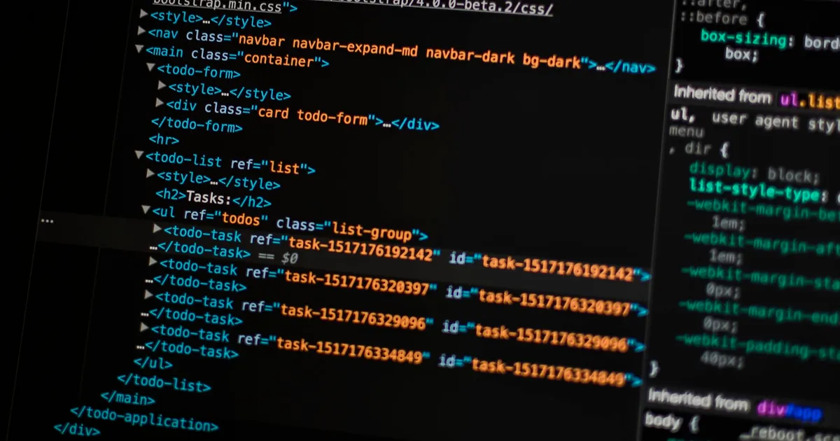
Web accessibility, often abbreviated a11y (the “11” standing for the eleven letters between the “a” and the “y”), is the practice of building websites and applications that people with disabilities can use. That includes people navigating with a screen reader, people who can’t use a mouse and rely entirely on a keyboard, people with low vision who need high contrast or larger text, and people with motor impairments who need generous click targets and forgiving interaction timing.
It’s not a checklist you run once before launch. It’s a set of habits that, done well, mostly disappear into how you already write HTML and CSS.
The four principles behind it
Most accessibility guidance traces back to four principles, often remembered by the acronym POUR:
- Perceivable — information must be presentable in ways users can perceive, regardless of sense. Images need text alternatives; video needs captions; content shouldn’t rely on color alone to convey meaning.
- Operable — interface components must be operable by keyboard alone, with no interaction that requires a mouse or a precise, fast gesture.
- Understandable — content and interface behavior should be predictable. Form errors should be clear; navigation shouldn’t change unexpectedly.
- Robust — content should work reliably across browsers and assistive technologies, now and as those technologies evolve.
These four ideas cover the vast majority of practical accessibility work, even before you look at any specific rule set.
Semantic HTML does most of the work
The single highest-leverage thing you can do for accessibility is use the right HTML element for the job. A <button> is focusable, operable with both Enter and Space, and announced as a button by screen readers — all for free. A <div onclick="..."> styled to look like a button gets none of that; you’d have to hand-wire tabindex, keyboard handlers, and ARIA roles to get back to where <button> started.
The same logic applies throughout the page: use <nav> for navigation, <main> for the primary content region, <h1>–<h6> in a logical, unbroken hierarchy, and <label> elements tied to form inputs via for/id. Screen reader users frequently navigate by jumping between landmarks and headings rather than reading top to bottom, so a page’s heading structure functions like a table of contents.
ARIA: a supplement, not a substitute
WAI-ARIA (Accessible Rich Internet Applications) attributes — role, aria-label, aria-expanded, aria-live, and others — let you describe custom widgets that native HTML doesn’t cover, like tab panels, comboboxes, or toast notifications. The first rule of ARIA is to not use it where a native element would already do the job: an aria-role="button" on a <div> is strictly worse than a real <button>, because you still have to replicate all the keyboard behavior yourself and it’s easy to get subtly wrong.
Used correctly, ARIA fills real gaps. aria-live="polite" on a region that updates dynamically — a form validation message, a live search result count — tells screen readers to announce the change without interrupting the user. aria-expanded on a disclosure toggle communicates open/closed state that’s otherwise only visible.
Focus, contrast, and alt text
Three patterns account for a disproportionate share of real-world accessibility bugs:
- Focus visibility. Never remove the default focus outline (
outline: none) without replacing it with an equally visible custom style. Keyboard users rely on it to know where they are on the page. - Color contrast. Text needs sufficient contrast against its background to be readable by people with low vision or color blindness — this is a common failure in the low-contrast gray-on-white text trend from a few years back.
- Alt text. Every meaningful
<img>needs analtattribute describing its content or function, not its filename. Purely decorative images should usealt=""so screen readers skip them instead of announcing something meaningless.
Keyboard navigation as a smoke test
You don’t need specialized hardware to catch most accessibility problems. Unplug your mouse, or just don’t touch it, and try to complete your site’s core flows using only Tab, Shift+Tab, Enter, and Space. If you can’t reach a control, can’t tell which element is focused, or trigger a keyboard trap you can’t Tab out of, you’ve found a real bug that affects real users — not a theoretical one.
Automated tools (like axe or Lighthouse’s accessibility audit) catch a meaningful chunk of issues — missing alt text, insufficient contrast, missing form labels — but they can’t tell you whether your custom dropdown actually behaves sensibly with a screen reader. Automated checks and manual keyboard testing are complementary, not substitutes for each other.
Accessibility and performance overlap more than you’d think
A lot of what improves accessibility also improves the metrics covered in our Core Web Vitals guide: semantic markup renders faster and requires less JavaScript than div-soup with synthetic interactivity bolted on, and a page that’s navigable by keyboard tends to have a cleaner, more predictable DOM structure to begin with. Accessibility, performance, and SEO all reward the same underlying discipline — write markup that describes what the content actually is, not just how it should look.
The takeaway
Accessibility isn’t a separate feature you bolt on at the end — it’s largely a byproduct of using semantic HTML correctly, keeping focus visible, writing meaningful alt text, and reserving ARIA for the gaps native elements don’t cover. Test your core flows with a keyboard before you ship, run an automated audit to catch the mechanical issues, and treat POUR as a lens for reviewing any new interface you build.
Keep reading
 Takina · · 4 min read
 The HTML inert Attribute, Explained
The inert attribute removes an element and its children from focus, click handling, and screen reader access in one line, without hiding it visually.
 Takina · · 4 min read
 Semantic HTML Elements Explained
Semantic HTML elements like nav, article, and main describe meaning, not just appearance, improving accessibility and SEO. How to use them.
Takina · · 4 min read The HTML dialog Element Explained
The native dialog element gives you modals and popovers with built-in focus trapping and accessibility, no JavaScript library required. Here's how it works.